


Rebrand boldly declares Texas's first university is home to the Pirates.
The Southwestern University Pirates are unveiling a new athletics logo in a brand relaunch that boldly reaffirms Southwestern's history as the first institution of higher learning in Texas.
Southwestern's origins trace back to 1840, just a few years after the formation of the Republic of Texas. On April 21, 1884, Southwestern played in the first intercollegiate baseball game in the state of Texas, defeating the University of Texas 52–12. The University added football in 1894 and officially entered intercollegiate athletics in 1908, holding the first homecoming on record in 1909.
"When you think of Texas sports, you think of summer on the baseball diamond, fall afternoons tailgating and cheering under stadium lights, and, of course, homecoming," Director of Intercollegiate Athletics Glenn Schwab says. "Schools love to show off their Texas pride, but not every university gets to say they were Texas's first. I'm proud to see Southwestern athletics celebrating our history through this rebranding."
Southwestern takes pride in its innovation and in empowering its student body. As such, Southwestern's athletics rebrand was done entirely in-house. In an era when intercollegiate athletics programs partner with large marketing firms to create new identities, the rebrand was a collaborative effort between the University's Creative Director Matt Madsen and student-athlete Mason Biggers '21, who was a team captain on the 2020–2021 football team.
Biggers approached Madsen for assistance on a project for his graduate-school application, beginning a process in which the duo researched Southwestern's vast history to create a modern look while paying homage to the past.
"I spent four years at Southwestern, so I feel like I can tell the story of the University and my experience there. By doing it all in-house, it keeps everything on-brand and, more importantly, authentic," Biggers says. "Universities are where students come to learn and grow, and I think the way Southwestern empowered me to work with Matt on this project exemplifies how everyone here wants everyone to become the best version of themselves."
Rebranding the athletics logo is part of a new initiative by Southwestern to tout its tight-knit culture and increase its national visibility. "We have just launched our 2021–2026 Tactical Plan to distinguish Southwestern as a top liberal-arts university in the nation," says Scarlett J. Moss, chief marketing and communications officer and Southwestern alumna. "Introducing this fresh athletics brand not only provides a renewed sense of pride and community among Pirates everywhere, but it shows off the creative and collaborative approach this university takes with everything we do."

Primary Logo
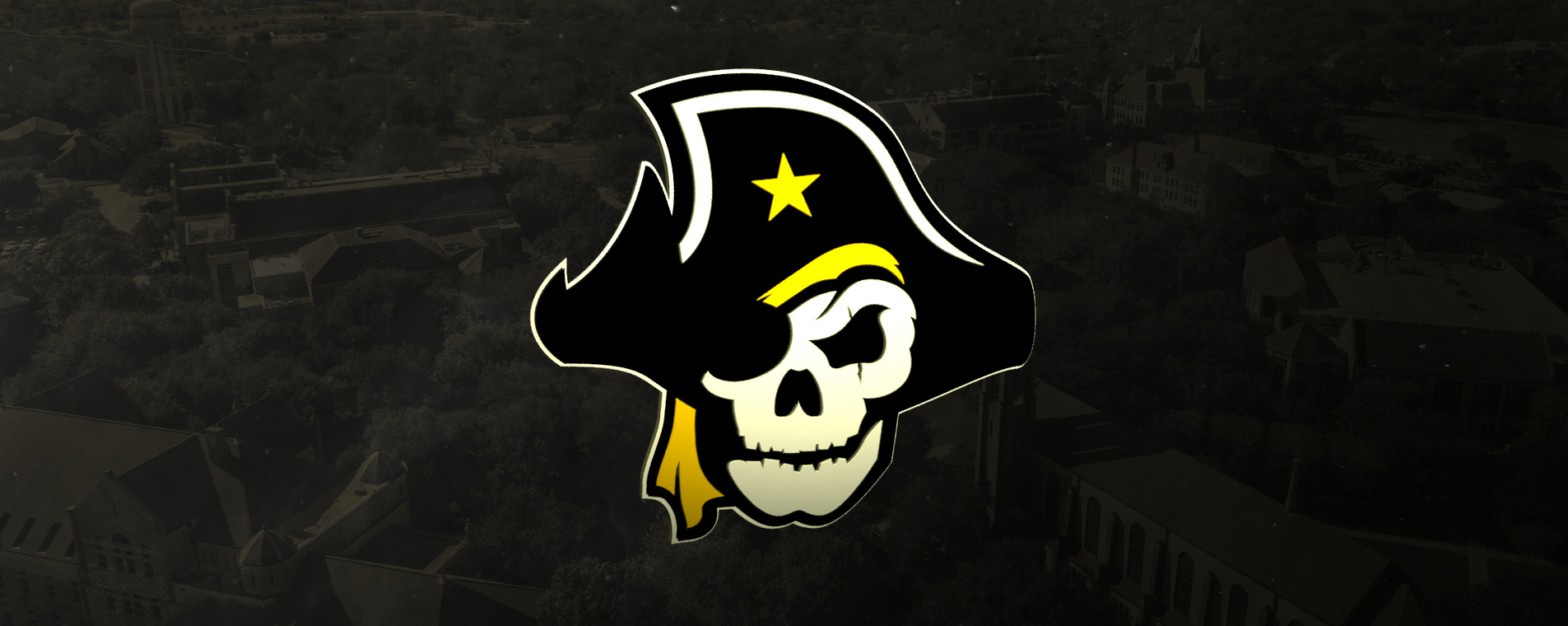
In designing the new primary logo, Madsen and Biggers leaned heavily on the Pirate identity and Southwestern's rich history. The Jolly Roger is one of the most distinct, evocative symbols in history, and the new logo takes from that symbol's design elements to create a look that stands out amid a sea of collegiate athletic brands.
"At first glance, the primary is bold and intimidating, which is always a goal with athletics. In the design process, I wanted to make sure that when stacked against any sports logo, be it professional or collegiate at any level, our marks are top-shelf. Weaving in Southwestern's DNA and key elements of its history is only going to keep the brand strong and relevant for years to come. A majority of sports teams and universities outsource projects like this, so being able to knock it out in-house and come out where we did is really special," says Madsen. "It speaks a lot to what can be accomplished here."
The Pirate skull, adorned in plunder black and doubloon gold, is a visually striking image. The menacing scowl with its jagged teeth pays homage to Southwestern's first athletics logo. The left eye's scar is a reminder that the Southwestern Pirates are battle-tested and no strangers to adversity, having competed in intercollegiate athletics for more than a century.
The tattered tricorn pirate hat evokes rogue waves in stormy waters—a reminder that a smooth sea never made a skilled Pirate. Displayed prominently on the cap is the star of Texas, showing SU's pride in being Texas's first university. Underneath the tricorn, a bandana falls to the southwestern side of the Pirate's face.

Secondary Logo
The secondary logo is a stylized Texas pirate flag in plunder black, siege white, and doubloon gold. In place of the Lone Star is the shape of Texas with Southwestern's founding year of 1840.

Wordmark
Southwestern's new Pirates wordmark again features the star of Texas prominently in the middle. The typefaces selected display a nautical quality, bringing to mind wind moving through sails.
Madsen and Biggers created more than 150 variations of primary logos, secondary logos, and wordmarks, drawing from Southwestern's past. The Pirates' first logo, created in 1929, was a basic skull-and-crossbones motif, with various pirate images taking center stage over the years until being phased out in the mid-1990s in favor of the interlocking "SU" and sabers.
The duo settled on a clean, back-to-basics rebrand to galvanize school spirit not only within the Southwestern family but also within the Georgetown community and across Texas.
Most importantly, the world will know Texas's first university is home to the Pirates.